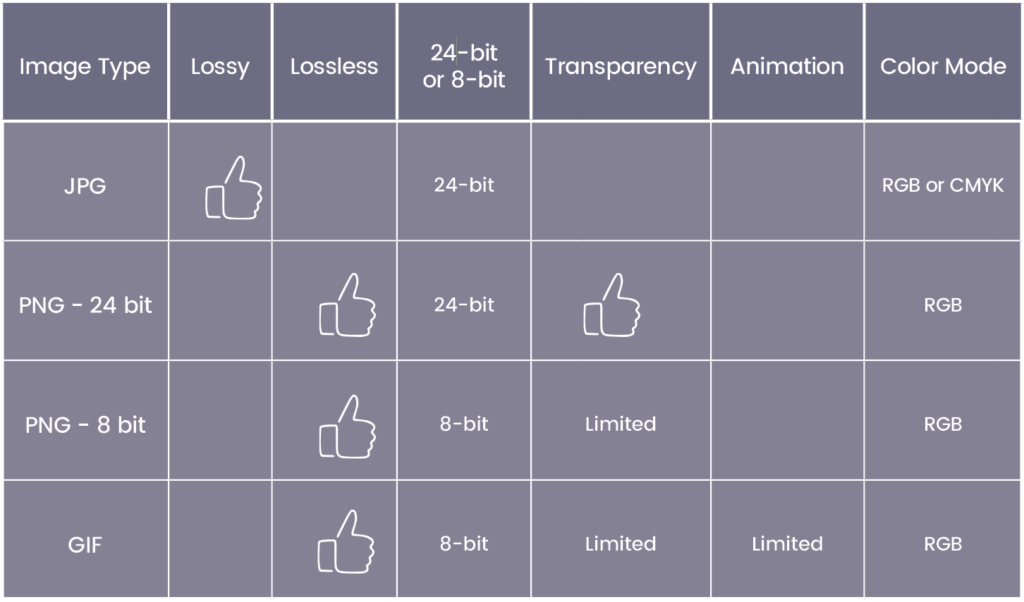
When should you use pngs and when should you use jpgs? What is a png anyway? Here is a concise, but handy guide to help you decide what type of images are best to use for different types of projects. For now, we are going to focus on three main file types:
- JPG – Joint Photographic Experts Group
- PNG (24-bit and 8-bit) – Portable Network Graphic
- GIF – Graphical Interchange Format
Before we get to the nitty-gritty on these file types, let’s go over a few concepts so we are all on the same page. Here are some important things to know before we move forward:
Lossy vs. Lossless
– When an image is lossy, it means that as the image is compressed, pixel data is thrown out and the image cannot be re-enlarged without losing some clarity. When an images is lossless, you can compress it without losing any data or resolution from the original image.
24-bit vs. 8-bit
This refers to the spectrum of colors that are supported on a certain image type. For example, 24-bit images support 8 bits on each channel, which can generate 16.7 million colors—plenty to choose from. On the other hand, 8-bit image files have access to a total of 256 colors. One thing to keep in mind: the more bits on the graphic, the larger it will be as the fourth channel adds more data to the image.
RGB vs. CMYK
– RGB (red, green, blue) refers to the primary colors of light. These three colors make up all the colors you see on a computer screen in an additive process the starts with a dark screen. All images used on screen should be in RGB color mode. CMYK (Cyan, Magenta, Yellow, Key-Black) refers to the four colors used in printing to create a full spectrum of colors. Images or designs set up for print purposes should be in CMYK mode.
Now, here is the scoop on each file type:

When formatting images or graphics for web or print, you need to keep in mind that there is a real balance between the quality of the image, and the size of the image. For example, if your website is full of really great photos, but no one has time to wait for them to download, then you’ve missed the mark. Or if your print design uses the wrong color mode, it doesn’t matter how great the design is if the colors are off. Keep the above graphic handy so you can get it right—every time.
